Visualizing Data
Overview
Teaching: 60 min
Exercises: 20 minQuestions
How can I explore my data by visualization in R?
Objectives
To be able to use ggplot2 to visuzlize your data
To understand the basic grammar of graphics, including the aesthetics and geometry layers, adding statistics, transforming scales, and coloring or panelling by groups.
Data visualization
Introduction
“The simple graph has brought more information to the data analyst’s mind than any other device.” — John Tukey
In this lesson we will learn how to visualise your data using ggplot2. R has several systems for making graphs, but ggplot2 is one of the most elegant and most versatile. ggplot2 implements the grammar of graphics, a coherent system for describing and building graphs. With ggplot2, you can do more faster by learning one system and applying it in many places.
The lesson is based on Chapter 8 of the Bioinformatics Data Skills book by Vince Buffalo and Chapter 2 of the R for Data Science book by Garrett Grolemund and Hadley Wickham.
Prerequisites
ggplot2 is one of the core members of the tidyverse. Load the tidyverse by running this code:
library(tidyverse)
If you run this code and get the error message “there is no package called ‘tidyverse’”, you’ll need to first install it, then run library() once again.
install.packages("tidyverse")
library(tidyverse)
Tip
You only need to install a package once, but you need to reload it every time you start a new session. You can also use
require()function to check whether ggplot2 is already installed:if (!require("ggplot2")) install.packages("ggplot2") library(ggplot2)
Dataset
We will use the dataset Dataset_S1.txt from the paper “The Influence of Recombination on Human Genetic Diversity”.
As a reminder, it contains estimates of population genetics statistics such
as nucleotide diversity (e.g., the columns Pi and Theta), recombination (column Recombination),
and sequence divergence as estimated by percent identity between human and chimpanzee genomes
(column Divergence). Other columns contain information about the sequencing depth (depth),
and GC content (percent.GC) for 1kb windows in human chromosome 20.
Let’s read it as a tibble and modify as we did before:
dvst <- read_csv("https://raw.githubusercontent.com/vsbuffalo/bds-files/master/chapter-08-r/Dataset_S1.txt")
Parsed with column specification:
cols(
  start = col_integer(),
  end = col_integer(),
  `total SNPs` = col_integer(),
  `total Bases` = col_integer(),
  depth = col_double(),
  `unique SNPs` = col_integer(),
  dhSNPs = col_integer(),
  `reference Bases` = col_integer(),
  Theta = col_double(),
  Pi = col_double(),
  Heterozygosity = col_double(),
  `%GC` = col_double(),
  Recombination = col_double(),
  Divergence = col_double(),
  Constraint = col_integer(),
  SNPs = col_integer()
)
Tip
Note, that we are reading the file with dplyr function
read_csvrather than the base functionread.cvs!
(dvst <- dvst %>%
  mutate(diversity = Pi / (10*1000), cent = (start >= 25800000 & end <= 29700000)) %>%
  rename(percent.GC = `%GC`, total.SNPs = `total SNPs`, total.Bases = `total Bases`, reference.Bases = `reference Bases`))
# A tibble: 59,140 x 18
   start   end total.SNPs total.Bases depth `unique SNPs` dhSNPs
   <int> <int>      <int>       <int> <dbl>         <int>  <int>
 1 55001 56000          0        1894  3.41             0      0
 2 56001 57000          5        6683  6.68             2      2
 3 57001 58000          1        9063  9.06             1      0
 4 58001 59000          7       10256 10.3              3      2
 5 59001 60000          4        8057  8.06             4      0
 6 60001 61000          6        7051  7.05             2      1
 7 61001 62000          7        6950  6.95             2      1
 8 62001 63000          1        8834  8.83             1      0
 9 63001 64000          1        9629  9.63             1      0
10 64001 65000          3        7999  8.00             1      1
# ... with 59,130 more rows, and 11 more variables: reference.Bases <int>,
#   Theta <dbl>, Pi <dbl>, Heterozygosity <dbl>, percent.GC <dbl>,
#   Recombination <dbl>, Divergence <dbl>, Constraint <int>, SNPs <int>,
#   diversity <dbl>, cent <lgl>
Exploring Data Visually with ggplot2 I: Scatterplots and Densities
We’ll start by using ggplot2 to create a scatterplot of nucleotide diversity along the chromosome. But because our data is window-based, we’ll first add a column called position that’s the midpoint between each window:
dvst <- mutate(dvst, position = (end + start) / 2)
Now we make a ggplot:
ggplot(data = dvst) + geom_point(mapping=aes(x=position, y=diversity))

Note
With ggplot2, you begin a plot with the function
ggplot().ggplot()creates a coordinate system that you can add layers to. The first argument ofggplot()is the dataset to use in the graph. Soggplot(data = dvrs)creates an empty graph.You complete your graph by adding one or more layers to
ggplot().geom_point()is a type of geometric object (or geom in ggplot2 lingo) that creates a scatterplot. Note, that to add a layer, we use the same+operator that we use for addition in R.Each geom function in ggplot2 takes a
mappingargument. This defines how variables in your dataset are mapped to visual properties. Themappingargument is always paired withaes(), and thexandyarguments ofaes()specify which variables to map to the x and y axes. ggplot2 looks for the mapped variable in thedataargument, in this case,dvrs.
A graphing template
Let’s turn this code into a reusable template for making graphs with ggplot2. To make a graph, replace the bracketed sections in the code below with a dataset, a geom function, or a collection of mappings.
ggplot(data = <DATA>) +
  <GEOM_FUNCTION>(mapping = aes(<MAPPINGS>))
ggplot2 has many geoms (e.g., geom_line(), geom_bar(), etc). We’ll talk about them later.
Aesthetic mappings
“The greatest value of a picture is when it forces us to notice what we never expected to see.” — John Tukey
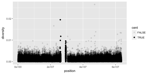
Notice the missing diversity estimates in the middle of this plot. What’s going on in this region? ggplot2’s strength is that it makes answering these types of questions with exploratory data analysis techniques effortless. We simply need to map a possible confounder or explanatory variable to another aesthetic and see if this reveals any unexpected patterns. In this case, let’s map the color aesthetic of our point geometric objects to the column cent, which indicates whether the window falls in the centromeric region of this chromosome
ggplot(data = dvst) + geom_point(mapping = aes(x=position, y=diversity, color=cent))

In the above example, we mapped cent to the color aesthetic, but we could have mapped it to other
aesthetic in the same way. Here are examples of mapping cent to the alpha aesthetic, which controls
the transparency of the points, or the shape of the points.
# Left
ggplot(data = dvst) +
  geom_point(mapping = aes(x = position, y = diversity, alpha = cent))
# Right
ggplot(data = dvst) +
  geom_point(mapping = aes(x = position, y = diversity, shape = cent))
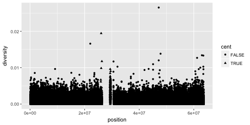
This did not work so well, but you should get an idea!
Note
Geometric objects have many aesthetic attributes (e.g., color, shape, size, etc.). The beauty of ggplot2s grammar is that it allows you to map geometric objects’ aesthetics to columns in your dataframe. The
aes()function gathers together each of the aesthetic mappings used by a layer and passes them to the layer’s mapping argument. The syntax highlights a useful insight aboutxandy: the x and y locations of a point are themselves aesthetics, visual properties that you can map to variables to display information about the data. Once you map an aesthetic, ggplot2 takes care of the rest. It selects a reasonable scale to use with the aesthetic, and it constructs a legend that explains the mapping between levels and values. For x and y aesthetics, ggplot2 does not create a legend, but it creates an axis line with tick marks and a label. The axis line acts as a legend: it explains the mapping between locations and values.
You can also set the aesthetic properties of your geom manually. For example, we can make all of the points in our plot blue:
ggplot(data = dvst) +
  geom_point(mapping = aes(x = position, y = diversity), color = "blue")

Here, the color doesn’t convey information about a variable, but only changes the
appearance of the plot. To set an aesthetic manually, set the aesthetic by name
as an argument of your geom function; i.e. it goes outside of aes(). You’ll
need to pick a value that makes sense for that aesthetic:
- The name of a color as a character string.
- The size of a point in mm.
- The shape of a point as a number, as shown in Figure \@ref(fig:shapes).
 have a border determined by `colour`; the solid shapes (15--18) are filled with `colour`; the filled shapes (21--24) have a border of `colour` and are filled with `fill`.")
Finally, note, that aesthetic mappings can also be specified in the call to ggplot(); different geoms will then use this mapping:
ggplot(data = dvst, mapping = (aes(x=position, y=diversity))) + geom_point()
Exercises
-
What’s gone wrong with this code? Why are the points not blue?
ggplot(data = mpg) +
  geom_point(mapping = aes(x = displ, y = hwy, color = "blue"))
-
Which variables in
mpgare categorical? Which variables are continuous? (Hint: type?mpgto read the documentation for the dataset). How can you see this information when you runmpg? -
Map a continuous variable to
color,size, andshape. How do these aesthetics behave differently for categorical vs. continuous variables? -
What happens if you map the same variable to multiple aesthetics?
-
What does the
strokeaesthetic do? What shapes does it work with? (Hint: use?geom_point) -
What happens if you map an aesthetic to something other than a variable name, like
aes(colour = displ < 5)?
Common problems
As you start to run R code, you’re likely to run into problems. Don’t worry — it happens to everyone! R is extremely picky, and a misplaced character can make all the difference. Make sure that every
(is matched with a)and every"is paired with another". Sometimes you’ll run the code and nothing happens. Check the left-hand of your console: if it’s a+, it means that R doesn’t think you’ve typed a complete expression and it’s waiting for you to finish it. In this case, it’s usually easy to start from scratch again by pressing ESCAPE to abort processing the current command. One common problem when creating ggplot2 graphics is to put the+in the wrong place: it has to come at the end of the line, not the start. In other words, make sure you haven’t accidentally written code like this:ggplot(data = dvst) + geom_point(mapping = aes(x = position, y = diversity))
Overplotting
One problem with our plots (and scatterplots in general) is overplotting (some data points obscure the information of other data points). We can’t get a sense of the distribution of diversity from this figure everything is saturated from about 0.05 and below. One way to alleviate overplotting is to make points somewhat transparent (the transparency level is known as the alpha):
ggplot(data = dvst) + geom_point(mapping = aes(x=position, y=diversity), alpha=0.01)
 Note that we set alpha=0.01 outside of the aesthetic mapping function aes() as we did with the color in
the previous example. This is because we’re not mapping the alpha aesthetic to a column of data in our dataframe, but rather giving it a fixed value for all data points.
Note that we set alpha=0.01 outside of the aesthetic mapping function aes() as we did with the color in
the previous example. This is because we’re not mapping the alpha aesthetic to a column of data in our dataframe, but rather giving it a fixed value for all data points.
Let’s now look at the density of diversity across all positions. We’ll use a different geometric object,
geom_density(), which is slightly different than geom_point() in that it takes the data and calculates
a density from it for us:
ggplot(data = dvst) + geom_density(mapping = aes(x=diversity), fill="blue")

We can also map the color aesthetic of geom_density() to a discrete-valued column in our dataframe,
just as we did with geom_point(). geom_density() will create separate density plots, grouping data
by the column mapped to the color aesthetic and using colors to indicate the different densities.
To see both overlapping densities, we use alpha to set the transparency to 0.4:
ggplot(data = dvst) + geom_density(mapping = aes(x=diversity, fill=cent), alpha=0.4)

Immediately we’re able to see a trend that wasn’t clear by using a scatterplot: diversity is skewed to more extreme values in centromeric regions. Again (because this point is worth repeating), mapping columns to additional aesthetic attributes can reveal patterns and information in the data that may not be apparent in simple plots.
Exploring Data Visually with ggplot2 II: Smoothing
Let’s look at the Dataset_S1.txt data using another useful ggplot2 feature: smoothing. We’ll use ggplot2 in particular to investigate potential confounders in genomic data. There are numerous potential confounders in genomic data (e.g., sequencing read depth; GC content; mapability, or whether a region is capable of having reads correctly align to it; batch effects; etc.). Often with large and high-dimension datasets, visualization is the easiest and best way to spot these potential issues.
Earlier, we used transparency to give us a sense of the most dense regions. Another
strategy is to use ggplot2’s geom_smooth() to add a smoothing line to plots and look
for an unexpected trend. Let’s use a scatterplot and smoothing curve to look at the
relationship between the sequencing depth (the depth column) and the total number of
SNPs in a window (the total.SNPs column):
ggplot(data = dvst, mapping = aes(x=depth, y=total.SNPs)) + geom_point(alpha=0.1) + geom_smooth()
`geom_smooth()` using method = 'gam'

Notice that because both geom_point() and geom_smooth() use the same x and y mapping, we can specify
the aesthetic in ggplot() function.
Discussion
What does this graph tells us about the relationship between depth of sequencing and SNPs?
Challenge 2
Explore the effect GC content has on depth of sequencing in the dataset.
Solution to challenge 2
ggplot(data = dvst, mapping = aes(x=percent.GC, y=depth)) + geom_point() + geom_smooth()`geom_smooth()` using method = 'gam'

Challenge 1
While ggplot2 chooses smart labels based on your column names, you might want to change this down the road. ggplot2 makes specifying labels easy: simply use the
xlab(),ylab(), andggtitle()functions to specify the x-axis label, y-axis label, and plot title. Change x- and y-axis labels when plotting the diversity data with x label “chromosome position (basepairs)” and y label “nucleotide diversity”.Solution to challenge 1
ggplot(dvst) + geom_point(aes(x=position, y=diversity)) + xlab("chromosome position (basepairs)") + ylab("nucleotide diversity")

Binning Data with cut() and Bar Plots with ggplot2
Next, let’s take a look at a bar chart. Bar charts seem simple, but they reveal something subtle about plots.
Consider a basic bar chart, as drawn with geom_bar(). As you can see, there are ~60000 windows in the dataset,
most of them outside the centromeric region.
ggplot(data = dvst) +
  geom_bar(mapping = aes(x = cent))

On the x-axis, the chart displays cent, a variable from dvst. On the y-axis, it displays count,
but count is not a variable in dvst! Where does count come from? Many graphs, like scatterplots,
plot the raw values of your dataset. Other graphs, like bar charts, calculate new values to plot:
-
bar charts, histograms, and frequency polygons bin your data and then plot bin counts, the number of points that fall in each bin.
-
smoothers fit a model to your data and then plot predictions from the model.
-
boxplots compute a robust summary of the distribution and then display a specially formatted box.
The algorithm used to calculate new values for a graph is called a stat, short for statistical transformation.
The figure below describes how this process works with geom_bar().

You can learn which stat a geom uses by inspecting the default value for the stat argument.
For example, ?geom_bar shows that the default value for stat is “count”, which means that
geom_bar() uses stat_count(). stat_count() is documented on the same page as geom_bar(),
and if you scroll down you can find a section called “Computed variables”. That describes how
it computes two new variables: count and prop.
You can generally use geoms and stats interchangeably. For example, you can recreate the previous
plot using stat_count() instead of geom_bar():
ggplot(data = dvst) +
  stat_count(mapping = aes(x = cent))

This works because every geom has a default stat; and every stat has a default geom. This means that you can typically use geoms without worrying about the underlying statistical transformation. There are three reasons you might need to use a stat explicitly:
-
You might want to override the default stat. For example, the height of the bar may be already present in the data as another variable, in which case you will use
stat = "identity" -
You might want to override the default mapping from transformed variables to aesthetics. For example, you might want to display a bar chart of proportion, rather than count:
ggplot(data = dvst) +
  geom_bar(mapping = aes(x = cent, y = ..prop.., group = 1))
-
You might want to draw greater attention to the statistical transformation in your code. For example, you might use
stat_summary(), which summarises the y values for each unique x value, to draw attention to the summary that you’re computing:ggplot(data = dvst) + stat_summary( mapping = aes(x = cent, y = percent.GC), fun.ymin = min, fun.ymax = max, fun.y = median )
ggplot2 provides over 20 stats for you to use. Each stat is a function, so you can get help in the usual way, e.g. ?stat_bin. To see a complete list of stats, check the ggplot2 cheatsheet.
So far we used cent, the only discrete variable in our dataset. Let’s create another one by splitting the percent.GC into 5 categories:
dvst <- dvst %>%
  mutate(GC.binned = cut(percent.GC, 5));
select(dvst, GC.binned)
# A tibble: 59,140 x 1
   GC.binned
   <fct>
 1 (51.6,68.5]
 2 (34.7,51.6]
 3 (34.7,51.6]
 4 (34.7,51.6]
 5 (34.7,51.6]
 6 (34.7,51.6]
 7 (34.7,51.6]
 8 (34.7,51.6]
 9 (34.7,51.6]
10 (17.7,34.7]
# ... with 59,130 more rows
ggplot(data = dvst) + geom_bar(mapping = aes(x=GC.binned))

The bins created from cut() are useful in grouping data (a concept we often use in data analysis).
For example, we can use the GC.binned column to group data by %GC content bins to see how GC content
has an impact on other variables. To do this, we map aesthetics like color, fill, or linetype to our GC.binned column:
ggplot(data = dvst) + geom_density(mapping = aes(x=depth, linetype=GC.binned), alpha=0.5)

What happens if we geom_bar()’s x aesthetic is mapped to a continuous column (e.g., percent.GC)? geom_bar() will automatically bin the data itself, creating a histogram:
ggplot(data = dvst) + geom_bar(mapping = aes(x=percent.GC))

But it does not look like the plot we had! Hence, the challenge:
Challenge 3: Finding the Right Bin Width
We’ve seen before how different bin widths can drastically change the way we view and understand the data. Try creating a histogram of Pi with varying binwidths using:
ggplot(dvst) + geom_bar(aes(x=Pi), binwidth=1) + scale_x_continu ous(limits=c(0.01, 80)). Using scale_x_continuous() just ignores all windows with 0 Pi and zooms into the figure. Try binwidths of 0.05, 0.5, 1, 5, and 10. What do you observe?Solution to challenge 3
Smaller bin widths can fit the data better (revealing more subtle details about the distribution), but there’s a trade-off. As bin widths become narrower, each bin will contain fewer data points and consequently be more noisy (and undersmoothed). Using wider bins smooth over this noise. However, bins that are too wide result in oversmoothing, which can hide details about the data. ggplot(d, aes(x=percent.GC, y=depth)) + geom_point() + geom_smooth()
Exercises
-
What is the default geom associated with
stat_summary()? How could you rewrite the previous plot to use that geom function instead of the stat function? -
What does
geom_col()do? How is it different togeom_bar()? -
Most geoms and stats come in pairs that are almost always used in concert. Read through the documentation and make a list of all the pairs. What do they have in common?
-
What variables does
stat_smooth()compute? What parameters control its behaviour? -
In our proportion bar chart, we need to set
group = 1. Why? In other words what is the problem with these two graphs?ggplot(data = diamonds) + geom_bar(mapping = aes(x = cut, y = ..prop..)) ggplot(data = diamonds) + geom_bar(mapping = aes(x = cut, fill = color, y = ..prop..))
Position adjustments
There’s one more piece of magic associated with bar charts. You can color a bar chart using
either the colour aesthetic, or, more usefully, fill:
ggplot(data = dvst) +
  geom_bar(mapping = aes(x = GC.binned, colour = GC.binned))

ggplot(data = dvst) +
  geom_bar(mapping = aes(x = GC.binned, fill = GC.binned))

Note what happens if you map the fill aesthetic to another variable, like clarity: the bars are automatically stacked. Each colored rectangle represents a combination of cut and clarity.
ggplot(data = dvst) +
  geom_bar(mapping = aes(x = GC.binned, fill = cent))

The stacking is performed automatically by the position adjustment specified by the position argument. If you don’t want a stacked bar chart, you can use one of three other options: "identity", "dodge" or "fill".
-
position = "identity"will place each object exactly where it falls in the context of the graph. This is not very useful for bars, because it overlaps them. To see that overlapping we either need to make the bars slightly transparent by settingalphato a small value, or completely transparent by settingfill = NA.ggplot(data = dvst, mapping = aes(x = GC.binned, fill = cent)) + geom_bar(alpha = 1/5, position = "identity")
ggplot(data = dvst, mapping = aes(x = GC.binned, color = cent)) +
  geom_bar(fill = NA, position = "identity")
The identity position adjustment is more useful for 2d geoms, like points, where it is the default.
-
position = "fill"works like stacking, but makes each set of stacked bars the same height. This makes it easier to compare proportions across groups.ggplot(data = dvst) + geom_bar(mapping = aes(x = GC.binned, fill = cent), position = "fill")
-
position = "dodge"places overlapping objects directly beside one another. This makes it easier to compare individual values.ggplot(data = dvst) + geom_bar(mapping = aes(x = GC.binned, fill = cent), position = "dodge")
There’s one other type of adjustment that’s not useful for bar charts, but can be very useful for scatterplots, jitter. position = "jitter" adds a small amount of random noise to each point.
This spreads the points and expose those that othewise will be hidden by overplotting:
ggplot(data = mpg) +
  geom_point(mapping = aes(x = displ, y = hwy))

ggplot(data = mpg) +
  geom_point(mapping = aes(x = displ, y = hwy), position = "jitter")

Adding randomness seems like a strange way to improve your plot, but while it makes your graph less accurate at small scales, it makes your graph more revealing at large scales. Because this is such a useful operation, ggplot2 comes with a shorthand for geom_point(position = "jitter"): geom_jitter().
To learn more about a position adjustment, look up the help page associated with each adjustment: ?position_dodge, ?position_fill, ?position_identity, ?position_jitter, and ?position_stack.
Using ggplot2 Facets
Now we’ll return to the dataset we created (by merging) in one of our previous exercises. Here is what what we did:
#Read datasets
mtfs <- read_tsv("https://raw.githubusercontent.com/vsbuffalo/bds-files/master/chapter-08-r/motif_recombrates.txt")
Parsed with column specification:
cols(
  chr = col_character(),
  motif_start = col_integer(),
  motif_end = col_integer(),
  dist = col_double(),
  recomb_start = col_integer(),
  recomb_end = col_integer(),
  recom = col_double(),
  motif = col_character(),
  pos = col_character()
)
rpts <- read_tsv("https://raw.githubusercontent.com/vsbuffalo/bds-files/master/chapter-08-r/motif_repeats.txt")
Parsed with column specification:
cols(
  chr = col_character(),
  start = col_integer(),
  end = col_integer(),
  name = col_character(),
  motif_start = col_integer()
)
#Combine columns
rpts <- rpts %>%
  unite(pos, chr, motif_start, sep="-") %>%
  select(name, pos) %>%
  inner_join(mtfs, by="pos")
We will now explore these data using visualization technique known as facets. Facets allow us to visualize grouped data by creating a series of separate adjacent plots for each group. Let’s first glimpse at the relationship between recombination rate and distance to a motif. We’ll construct this graphic in steps:
p <- ggplot(data = rpts, mapping = aes(x=dist, y=recom)) + geom_point(size=1)
p <- p + geom_smooth(method="loess", se=FALSE, span=1/10)
print(p)

Note that we’ve turned off geom_smooth()’s standard error estimates,
adjusted the smoothing with span, and set the smoothing method to “loess”.
From this data, we only see a slight bump in the smoothing curve where the motifs reside. However, this data is a convolution of two different motif sequences on many different genomic backgrounds. In other words, there’s a large amount of heterogeneity we’re not accounting for, and this could be washing out our signal. Let’s use faceting to pick apart this data.
First, if you’ve explored the rpts dataframe, you’ll notice that the
motif column contains two variations of the sequence motif:
distinct(rpts, motif)
# A tibble: 2 x 1
  motif
  <chr>
1 CCTCCCTGACCAC
2 CCTCCCTAGCCAC
One way to compare these is by grouping and coloring the loess curves by motif sequence:
ggplot(data = rpts, mapping = aes(x=dist, y=recom)) + geom_point(size=1) + geom_smooth(aes(color=motif), method="loess", se=FALSE, span=1/10)

Alternatively, we can split these motifs apart visually with
facets using ggplot2’s facet_wrap() or facet_grid().
Facet_wrap()
To facet your plot by a single variable, use facet_wrap(). facet_wrap() takes a
factor column, creates a panel for each level and wraps around horizontally.
The first argument of facet_wrap() should be a formula, which you create with ~
followed by a variable name.
p <- ggplot(data = rpts, mapping = aes(x=dist, y=recom)) + geom_point(size=1, color="grey")
p <- p + geom_smooth(method='loess', se=FALSE, span=1/10)
p <- p + facet_wrap(~ motif)
print(p)

Facet_grid()
To facet your plot on the combination of two variables, add facet_grid() to your plot call.
The first argument of facet_grid() is also a formula. This time the formula should contain
two variable names separated by a ~.
If you prefer to not facet in the rows or columns dimension, use a . instead of a
variable name, e.g. + facet_grid(. ~ motif).
rpts
# A tibble: 9,218 x 10
   name  pos    chr   motif_start motif_end   dist recomb_start recomb_end
   <chr> <chr>  <chr>       <int>     <int>  <dbl>        <int>      <int>
 1 L2    chrX-… chrX     63005830  63005843  37772     62965644   62970485
 2 L2    chrX-… chrX     63005830  63005843  34673     62970484   62971843
 3 L2    chrX-… chrX     63005830  63005843  30084     62971842   62979662
 4 L2    chrX-… chrX     63005830  63005843  21750     62979661   62988511
 5 L2    chrX-… chrX     63005830  63005843  10682     62988510   63001800
 6 L2    chrX-… chrX     63005830  63005843   2210     63001799   63005455
 7 L2    chrX-… chrX     63005830  63005843 -  384     63005454   63006988
 8 L2    chrX-… chrX     63005830  63005843 - 3530     63006987   63011745
 9 L2    chrX-… chrX     63005830  63005843 - 6024     63011744   63011976
10 L2    chrX-… chrX     63005830  63005843 -12691     63011975   63025080
# ... with 9,208 more rows, and 2 more variables: recom <dbl>, motif <chr>
p <- ggplot(rpts, aes(x=dist, y=recom)) + geom_point(size=1, color="grey")
p <- p + geom_smooth(method='loess', se=FALSE, span=1/16)
p <- p + facet_grid(name ~ motif)
print(p)

We see some patterns emerging here: motif CCTCCCTAGCCAC on a THE1B repeat background has a strong effect on recombination rate, as does CCTCCCTGACCAC on a L2 repeat background. You can get a sense of the data that goes into this plot with:
table(rpts$name, rpts$motif, useNA="ifany")
        CCTCCCTAGCCAC CCTCCCTGACCAC
  L2              457          4110
  THE1B          4651             0
rpts %>%
  count(name, motif)
# A tibble: 3 x 3
  name  motif             n
  <chr> <chr>         <int>
1 L2    CCTCCCTAGCCAC   457
2 L2    CCTCCCTGACCAC  4110
3 THE1B CCTCCCTAGCCAC  4651
One important feature of facet_wrap() and facet_grid()
is that by default, x- and y-scales will be the same across
all panels. You can set scales to be free with scales=”free_x”
and scales=”free_y”, or scales=”free” to free both axes.
For example:
p <- ggplot(rpts, aes(x=dist, y=recom)) + geom_point(size=1, color="grey")
p <- p + geom_smooth(method='loess', se=FALSE, span=1/10)
p <- p + facet_wrap( ~ motif, scales="free_y")
print(p)

Challenge 4: Recombination rate by chromosome
Try using facets to look at this data when grouped by chromosome with facet_wrap( ~ chr).
Exercises
-
What happens if you facet on a continuous variable?
-
What do the empty cells in plot with
facet_grid(drv ~ cyl)mean? How do they relate to this plot?ggplot(data = mpg) + geom_point(mapping = aes(x = drv, y = cyl)) -
What plots does the following code make? What does
.do?ggplot(data = mpg) + geom_point(mapping = aes(x = displ, y = hwy)) + facet_grid(drv ~ .) ggplot(data = mpg) + geom_point(mapping = aes(x = displ, y = hwy)) + facet_grid(. ~ cyl) -
Take the first faceted plot in this section:
ggplot(data = mpg) +
  geom_point(mapping = aes(x = displ, y = hwy)) +
  facet_wrap(~ class, nrow = 2)
What are the advantages to using faceting instead of the colour aesthetic? What are the disadvantages? How might the balance change if you had a larger dataset?
-
Read
?facet_wrap. What doesnrowdo? What doesncoldo? What other options control the layout of the individual panels? Why doesn’tfacet_grid()havenrowandncolargument? -
When using
facet_grid()you should usually put the variable with more unique levels in the columns. Why?
Geometric objects
Let’s review some of the core concepts we saw above on a different dataset.
We can use different ways to
visualize our data by using different geoms. A geom is the geometrical object
that a plot uses to represent data. People often describe plots by the type of geom
that the plot uses. ggplot2 provides over 30 geoms, and extension packages provide
even more (see https://www.ggplot2-exts.org for a sampling). The best way to get
a comprehensive overview is the ggplot2 cheatsheet, which you can find at
http://rstudio.com/cheatsheets. To learn more about any single geom, use help:
?geom_smooth.
Many geoms, like geom_smooth(), use a single geometric object to display multiple rows
of data. For these geoms, you can set the group aesthetic to a categorical variable
to draw multiple objects. ggplot2 will draw a separate object for each unique value of
the grouping variable. In practice, ggplot2 will automatically group the data for
these geoms whenever you map an aesthetic to a discrete variable. It is convenient to
rely on this feature because the group aesthetic by itself does not add a legend or
distinguishing features to the geoms.
To display multiple geoms in the same plot, add multiple geom functions to ggplot():
ggplot(data = mpg) +
  geom_point(mapping = aes(x = displ, y = hwy)) +
  geom_smooth(mapping = aes(x = displ, y = hwy))

We say above that we can avoid duplications in this code by passing a set of mappings to
ggplot(). ggplot2 will treat these mappings as global mappings that apply to each geom
in the graph:
ggplot(data = mpg, mapping = aes(x = displ, y = hwy)) +
  geom_point() +
  geom_smooth()
If you place mappings in a geom function, ggplot2 will treat them as local mappings for the layer. It will use these mappings to extend or overwrite the global mappings for that layer only. This makes it possible to display different aesthetics in different layers.
ggplot(data = mpg, mapping = aes(x = displ, y = hwy)) +
  geom_point(mapping = aes(color = class)) +
  geom_smooth()

You can use the same idea to specify different data for each layer. Here, our smooth line
displays just a subset of the mpg dataset, the subcompact cars. The local data argument in geom_smooth() overrides the global data argument in ggplot() for that layer only.
ggplot(data = mpg, mapping = aes(x = displ, y = hwy)) +
  geom_point(mapping = aes(color = class)) +
  geom_smooth(data = filter(mpg, class == "subcompact"), se = FALSE)

Exercises
-
What geom would you use to draw a line chart? A boxplot? A histogram? An area chart?
-
Run this code in your head and predict what the output will look like. Then, run the code in R and check your predictions.
ggplot(data = mpg, mapping = aes(x = displ, y = hwy, color = drv)) + geom_point() + geom_smooth(se = FALSE) -
What does
show.legend = FALSEdo? What happens if you remove it?
Why do you think I used it earlier in the chapter? -
What does the
seargument togeom_smooth()do? -
Will these two graphs look different? Why/why not?
ggplot(data = mpg, mapping = aes(x = displ, y = hwy)) +
  geom_point() +
  geom_smooth()

ggplot() +
  geom_point(data = mpg, mapping = aes(x = displ, y = hwy)) +
  geom_smooth(data = mpg, mapping = aes(x = displ, y = hwy))
Coordinate systems
Coordinate systems are probably the most complicated part of ggplot2. The default coordinate system is the Cartesian coordinate system where the x and y positions act independently to determine the location of each point. There are a number of other coordinate systems that are occasionally helpful.
-
coord_flip()switches the x and y axes. This is useful (for example), if you want horizontal boxplots. It’s also useful for long labels: it’s hard to get them to fit without overlapping on the x-axis.#fig.width = 3, out.width = "50%", fig.align = "default"} ggplot(data = mpg, mapping = aes(x = class, y = hwy)) + geom_boxplot()
ggplot(data = mpg, mapping = aes(x = class, y = hwy)) +
  geom_boxplot() +
  coord_flip()
-
coord_quickmap()sets the aspect ratio correctly for maps. This is very important if you’re plotting spatial data with ggplot2.#fig.width = 3, out.width = "50%", fig.align = "default", message = FALSE} nz <- map_data("nz")Attaching package: 'maps'The following object is masked from 'package:purrr': mapggplot(nz, aes(long, lat, group = group)) + geom_polygon(fill = "white", colour = "black")
ggplot(nz, aes(long, lat, group = group)) + geom_polygon(fill = "white", colour = "black") + coord_quickmap()
-
coord_polar()uses polar coordinates. Polar coordinates reveal an interesting connection between a bar chart and a Coxcomb chart.#fig.width = 3, out.width = "50%", fig.align = "default", fig.asp = 1} bar <- ggplot(data = diamonds) + geom_bar( mapping = aes(x = cut, fill = cut), show.legend = FALSE, width = 1 ) + theme(aspect.ratio = 1) + labs(x = NULL, y = NULL) bar + coord_flip()
bar + coord_polar()
The layered grammar of graphics
In the previous sections, you learned much more than how to make scatterplots, bar charts, and boxplots. You learned a foundation that you can use to make any type of plot with ggplot2. To see this, let’s add position adjustments, stats, coordinate systems, and faceting to our code template:
ggplot(data = <DATA>) +
  <GEOM_FUNCTION>(
     mapping = aes(<MAPPINGS>),
     stat = <STAT>,
     position = <POSITION>
  ) +
  <COORDINATE_FUNCTION> +
  <FACET_FUNCTION>
Our new template takes seven parameters, the bracketed words that appear in the template. In practice, you rarely need to supply all seven parameters to make a graph because ggplot2 will provide useful defaults for everything except the data, the mappings, and the geom function.
The seven parameters in the template compose the grammar of graphics, a formal system for building plots. The grammar of graphics is based on the insight that you can uniquely describe any plot as a combination of a dataset, a geom, a set of mappings, a stat, a position adjustment, a coordinate system, and a faceting scheme.
You could use this method to build any plot that you imagine. In other words, you can use the code template that you’ve learned in this chapter to build hundreds of thousands of unique plots.
ggplot2 calls
So far we’ve been very explicit with ggplot2 code:
ggplot(data = faithful, mapping = aes(x = eruptions)) +
  geom_freqpoly(binwidth = 0.25)
Typically, the first one or two arguments to a function are so important that you should know them by heart. The first two arguments to ggplot() are data and mapping, and the first two arguments to aes() are x and y. And if you know them by heart, you don’t need to type them! That makes it easier to see what’s different between plots. Rewriting the previous plot more concisely yields:
ggplot(faithful, aes(eruptions)) +
  geom_freqpoly(binwidth = 0.25)
Sometimes we’ll turn the end of a pipeline of data transformation into a plot. Watch for the transition from %>% to +. I wish this transition wasn’t necessary but unfortunately ggplot2 was created before the pipe was discovered.
Key Points
Use
ggplot2to create plots.Think about graphics in layers: aesthetics, geometry, statistics, scale transformation, and grouping.